Oh, the Hackish Things You'll Do! An Ode to Content Marketers

There are a few things in life that make me positively, embarrassingly giddy. Making others laugh. Reunions with my oldest group of friends (some of whom I've known since I was two). Early morning writing sessions at a local coffee shop. Cooking for others (my Italian is showing). Heck, creating absolutely anything for others -- hence my love of content marketing, I suppose.
Bizarrely high on this list is watching someone enjoy a piece I've created -- article, graphic, podcast, you name it -- and then revealing to them just how hackish my process and tools were to create it.
As an aside, it's probably a good thing I enjoy making others laugh. I'm fairly certain I'd have zero designer friends otherwise, given how proud I am of my PowerPoint design skills. (That hiss you hear is every designer reading this putting a curse on me.)
Over the last few years, as I've worked in content marketing, I've realized something: I'm far from alone in my hackish abilities. In fact, there's practically a badge of honor at lacking formal training in a particular medium but overcoming that fact to produce high quality stuff. Hacks-for-Good, if you will. This isn't about pumping out more "stuff." This is about doing whatever it takes to compensate for a lack of formal training or particular skill -- or, at times, supplementing those things -- in order to be more prolific. And to me, someone is only prolific if they create a high volume of high quality things.
This fall at Content Marketing World, I'm giving two talks (because I'm an insane person) -- one talk is about my content marketing wheel playbook, but the other focuses on all these hackish things we do as content marketers while creating things. That latter one is titled Create Ugly: Clever, Sneaky, and Downright Brilliant Ways Prolific Content Creators Make “Quality vs. Quantity” a Pointless Debate.
Here's the deal: Content marketers are a crazy bunch of (awesome) misfits. We're a bizarre but interesting blend of backgrounds, experiences, career tracks, and skills, all mashed together to form this industry. No two of us seem cut from the same cloth, and as a result, all of us have used our own approaches to hack away at creating things.
Now, the exciting part is that this has created a huge, unspoken compendium of clever little tricks that, despite seeming atypical or improper to others, helps us get the job done. These are the things that enable someone to scoff at the idea that quality and quantity are in conflict. These are the things that turn someone into great creators of content. Masters of making. Moguls of media. Kings of kont--okay, too much.
Content X-Ray: Hacking PowerPoint Design
In honor of that second talk, I'll be sharing any creative hack I come across now through my talk -- whether my own or someone else's.
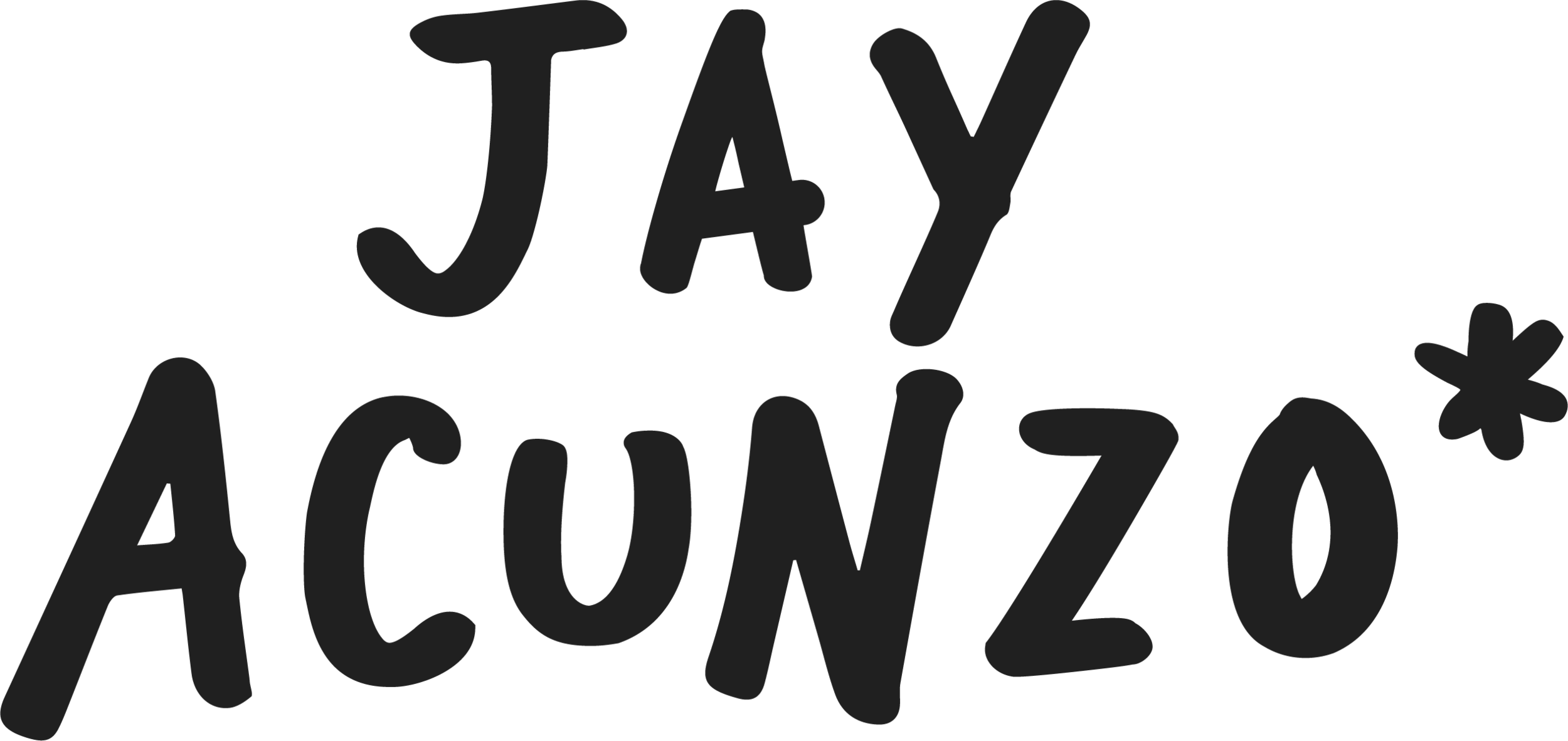
Below, I've written up what I like to call a "content x-ray" -- putting a lens over a project to see exactly how its made. This particular x-ray is for the graphic above. And yes, I created in PowerPoint. (That's the point.)
Let's begin...
First, I found the image for Oh, the Places You'll Go! by Dr. Seuss on Google Images.

"Wait, aren't you worried about copyright infringement?"
(1) I'm not a brand, so far less than I probably should. (2) If I get a cease and desist from his lawyers, then I'm doing something right in building my audience. (3) No, not really because internet?
Then I followed the following steps to hack this design. Apologies to all my designer friends staring holes in my forehead right now...
1. Crop to 2x wide as it is tall.
In PowerPoint (cue hiss from designer friends), I cropped the image to 2x as wide as it is tall. This means that it can serve as both a blog graphic and a tweet graphic, since those dimensions enable an image to appear right in the Twitter feed. That alone might be a subtle hack -- get more mileage out of one graphic.
(An easy way to ensure it's the right dimensions is to use the little measurements in the top right. Double-click the image or single-click then select Format Image in the menu.)

2. Remove the copy from the original.
Continuing our delightfully hackish process, I need to remove the copy in order to re-write my own headline and byline onto the image. To do so, I copy/paste the image in PowerPoint, creating a second version of the original.
I then crop that second image down to a small white corner of it. This similarly-colored background can then mask anything I want to remove. I simply drag it over and either resize or duplicate that white rectangle to place on top of the copy.

3. Add my own copy.
Here's where a knowledge of some hack-enabling tools comes in handy. If I want to write my own version of both headline and byline as you see it above, I'll ideally use a Seuss-like font.
For that, I use DaFont, a huge directory of free fonts. The particular one I use here is called "Doctor Soos Bold." (If you're new to installing fonts, note that you need to first install the file, then restart PowerPoint for the font to appear in your menu.)

4. Use the right color for my new copy.
This is yet another one of those "I can't believe this is how he does it" moments. The new copy written in Doctor Soos Bold is still not the exact same color as the original. To ensure the look and feel stays nearly identical, you can simply select "More Colors" and use the eyedropper to grab the copy from the original. (This might be easier to do before you cover up the old copy, but I tend to think pretty haphazardly when I do these things. Surprise, surprise.)

As an aside, another awesomely hackish but really useful tool is this one, which lets you upload any image, pick a color, and get the HTML color code. This is really useful if you work in a tool like Canva, for instance, which doesn't offer an eyedropper tool but instead requires that code. Highly suggest bookmarking it.
5. Warp the text to resemble the original
This one is simple: To create that curved effect, I simply created one new text box per line of copy to treat them differently, and then selected Effects > Transform > Arc Up.
6. Group the image together and save as picture.
At this point, I'm done with the design but not with the hacking (obviously). I select all images and right click > grouping > group. I then right click the now-lone image square and save as picture.
7. Compress the file.
Lastly, because it's a huge file when saved from PowerPoint, I want to shrink it to upload to my blog. For that, I use a free tool call Compressor.io.
(Oh, and as a bonus tool recommendation: I used Annotate, an app from Driftt, for my screenshots above. As a disclosure, we're investors in Driftt at NextView Ventures.)
It's my content, I can hack if I want to (hack if I want to)
One little graphic. Multiple hackish tricks. Tons of time saved. No dip in quality.
Literally thousands of these unspoken, hidden tricks exist in our industry. And my point is not to create THINGS that are ugly but rather embrace the fact that we all have processes might seem hideous to someone who's formally trained.
And while formal training is wonderful and should be sought out, it shouldn't prevent you from running fast, experimenting and learning often, and generating results.
In the end, in your career, whenever you hear that terrible, misguided debate of quality-versus-quantity, you want to possess the skills and knowledge to laugh and respond: "Both!"
Get Featured in My CMWorld Talk!
I'd love to crowdsource a few hacks you're particularly proud of. The one above is an example, as are these hidden things inside my podcast. Note that I'm looking for tricks, hacks, and sneaky little approaches to CREATING content. Using your favorite Google Analytics report to hunt for keywords or automating your social media posts, while useful, are not what I'm after here.
Email me with your favorite content creation hack.
Thanks for reading, sharing, and hope to see some of you in Cleveland this September!